Real Home: 9 dark and moody design tips to copy from an extended Edwardian semi
Vanessa and Andy Roberts bought their four-storey Edwardian semi in 2016 in the same town they’d recently renovated a converted coach house. It was one of eight built by the same architect and had been converted back into a house from three flats around 20 years ago. ‘The work had been badly done, but with 3,000 square feet to play with, there was lots of potential,’ says Vanessa.
Initially, the couple had grand plans for their house renovation, including a basement kitchen and a mezzanine above, but the quote was too high. Instead, they created an open-plan kitchen-diner by knocking through the old kitchen and dining room, and rebuilt the entire back of the house with lots of glass. On the first floor, two small rear bedrooms, a bathroom, corridor and sunroom were transformed into an L-shaped master bedroom with en suite and a quirky reading nook/office overlooking the garden.
The couple hired interior designer Karen Knox of Making Spaces before the architect and builder came on board. ‘People imagine interior design to be all about cushions and paint colours, but Karen’s mind is so practical,’ says Vanessa. ‘As soon as she walks in a room she’ll instantly notice the position of light switches, how the door opens, if the carpet needs replacing and even whether it’s worth moving a radiator to free up space for a future wardrobe. Paint colour is the last thing on her mind!’
Profile
The owners Vanessa Roberts, who works in commercial strategy (@vansoire), her husband Andy, head of projects, and their sons, Harrison, three, and baby Ethan
The property A five-bedroom Edwardian semi in Harrogate,
North Yorkshire
Project cost Around £150,000
Although the couple have now sold their house, they’ve learned a lot from the project. ‘Don’t worry about other people’s opinions as taste is so personal and changes with time,’ says Vanessa. ‘Once you start tapping into that creative bravery, it can take you in any given direction. As long as it makes you feel happy, that’s all that matters.’
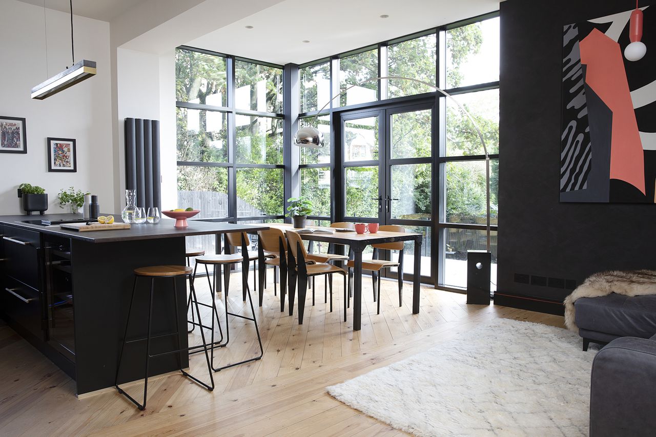
1. Use an aluminium curtain wall for industrial-style impact
Glazing, Concept Windows & Doors. Find similar Jean Prouve Standard chairs at Stone Butterfly. Arco lamp, Flos. Concrete and brass pendant light, GANT Lights
(Image credit: Katie Lee)
Want instant impact in your space? Opt for aluminium doors or – if your budget can stretch to it – a curtain wall. ‘Our glazing manufacturer suggested this commercial aluminium curtain walling system as a budget alternative to Crittall windows for the six-metre-wide opening,’ says Vanessa. ‘It cost around £15,000 as opposed to £40,000+ for the real thing.’ A big investment, sure – but the result says it all.
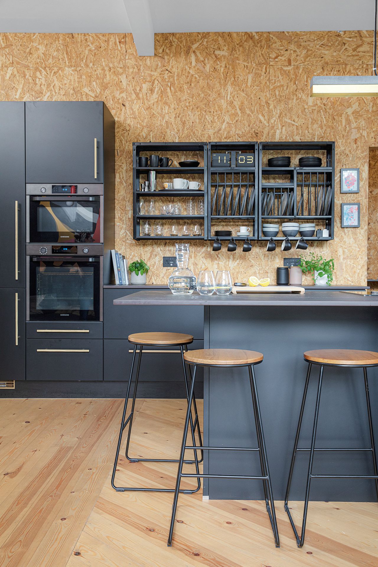
2. Think outside the box for your kitchen surfaces
Hacker Systemat kitchen, Interiors of Harrogate. Stools, Homebase. Plate racks and shelving, Stovold & Pogue. Brass bar handles, Dowsing & Reynolds
(Image credit: Katie Lee)
We love the finish of this quirky kitchen, complete with OSB wall and pine floorboards. FYI – these materials are cheap to use, too. Vanessa used the kitchen to balance out the cost of the glazing and window replacements for the front and back of the house. ‘We had our hearts set on a black Ikea kitchen made from recycled bottle tops, but instead we opted for a pre-built German kitchen from a local shop. By the time you’d factored in labour for building the flat pack, the price difference was marginal.’
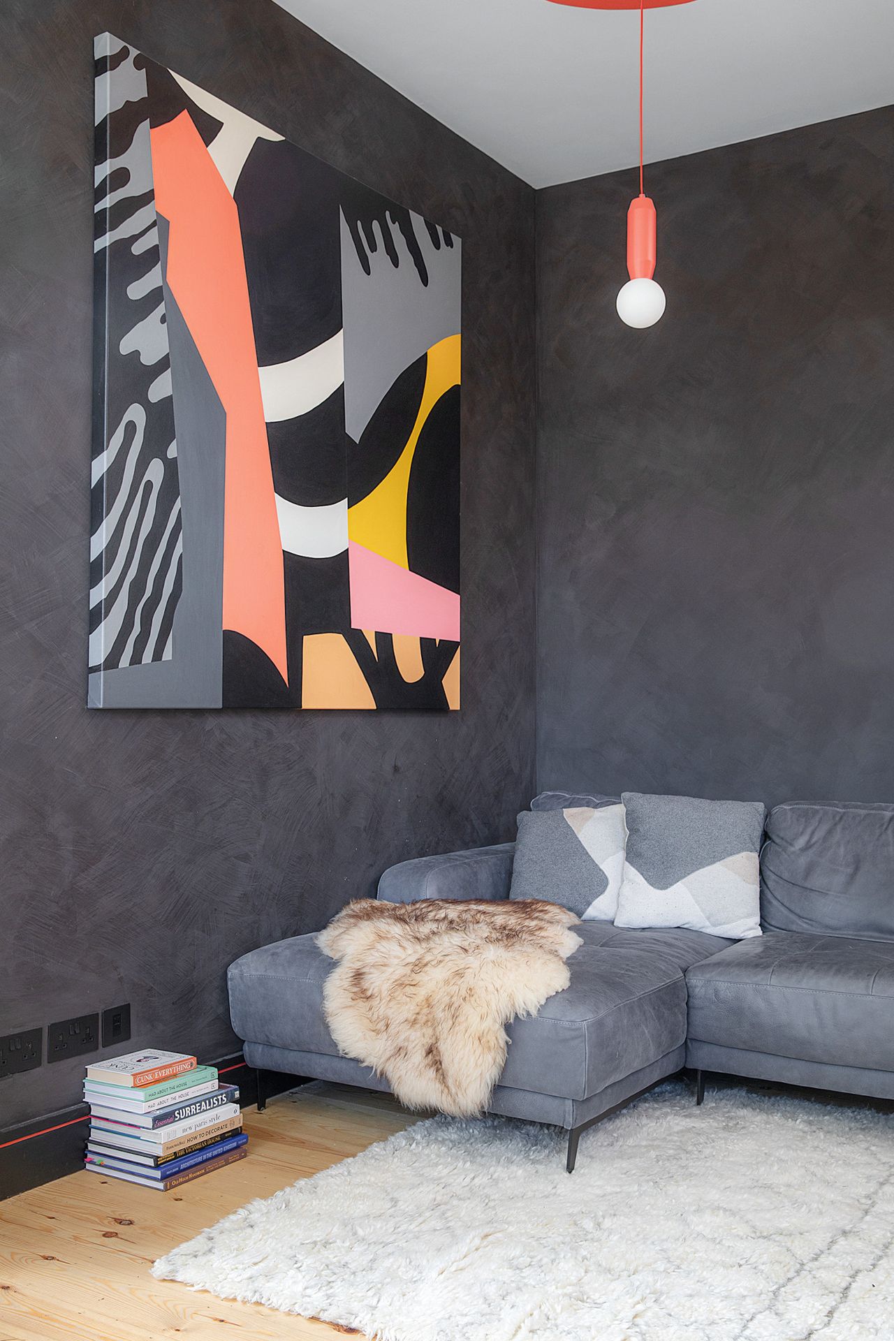
3. Bring texture in through your walls
Walls painted in Poppy Seed limewash, Abigail Ahern. Artwork, Andy Welland. Luciano sofa, Made. Pendant light, HouseOf
(Image credit: Katie Lee)
Vanessa experimented with a new limewash paint to add texture to the snug in the corner of the kitchen-diner. A huge piece of artwork makes a bold statement, but the wall carries the rest of the space – and we love the bright pop of colour from the pendant light.
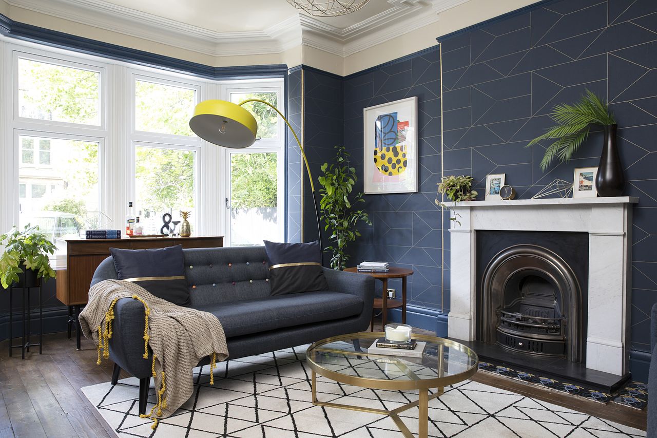
4. Go bold with wallpaper
Ferm Living Lines wallpaper, Cloudberry Living. Ritchie sofas, Made. Artwork, Andy Welland. Woodwork painted in Stiffkey Blue, Farrow & Ball. Rug, La Redoute. Floor lamp, Habitat
(Image credit: Katie Lee)
When it comes to wallpaper, more is almost always better. Interior designer Karen Knox suggested wrapping the entire drawing room and guest bedroom in a bold design to embrace the dark side. ‘Without her we probably would’ve just wallpapered the chimney breast,’ says Vanessa. ‘She really pushed us creatively and we got braver the longer we worked with her.’
5. Pay attention to the little touches
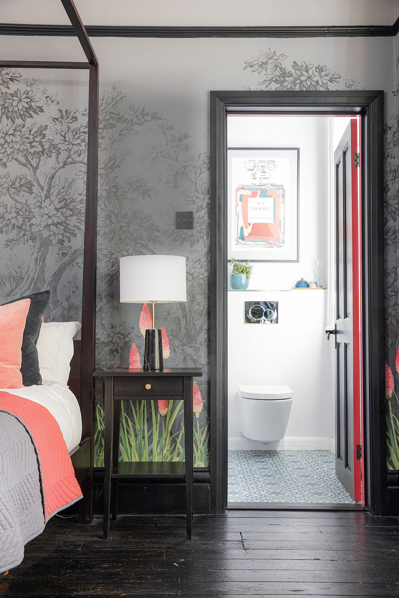
Upper Brook Street Minuit wallpaper; woodwork painted in Jack Black, both Little Greene. Goa bed, Maisons du Monde. Charleston bedspread and cushions, Made. Hemnes bedside table, Ikea, with brass knobs by Dowsing & Reynolds. Rita lamp, Made. Bathroom floor tiles, Topps Tiles. Chanel bottle artwork, Andy Welland.
(Image credit: Katie Lee)
A moody grey and black scheme is a running theme through Vanessa’s house, but have you noticed the thread of neon pink in the rooms, too? Here, it’s picked up in the wall mural and the bedspread – and there’s even a hint on the edges of the en suite door, which is a fun playful way to add subtle colour to any space.
6. Experiment with your bedroom
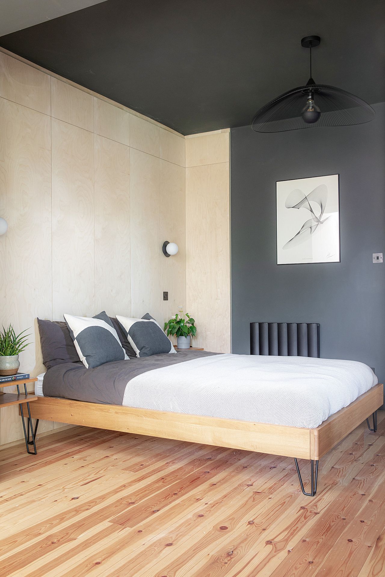
Wall lights, HouseOf. Brunel bed (minus headboard), Heal’s. Hiko pendant, John Lewis & Partners
(Image credit: Katie Lee)
A bedroom is the perfect place to try out design ideas you might be too scared to bring into the areas of your home that guests see more often. Here, Vanessa opted for plywood panels to create a larger-than-life headboard, contrasted with an enveloping black across the other walls and ceiling. Keep the accessories light to avoid overwhelming the space.
7. Built-in furniture can be chic
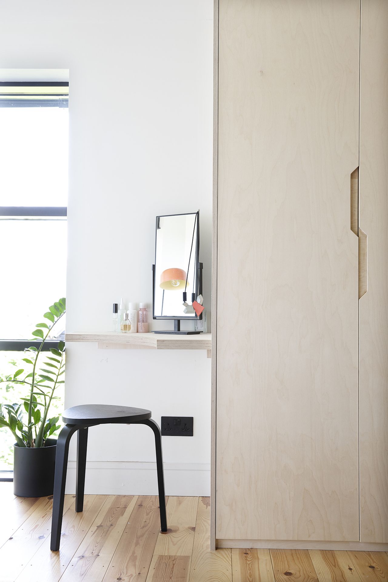
Kyree black stool, Ikea
(Image credit: Katie Lee)
Plywood is the material of the moment, and we love the simple addition of a dressing table to a run of cupboards. Pop on a mirror, add a black stool for contrast, and you’ve got a contemporary take on built-in furniture that’ll never date.
8. Terrazzo is always a good idea
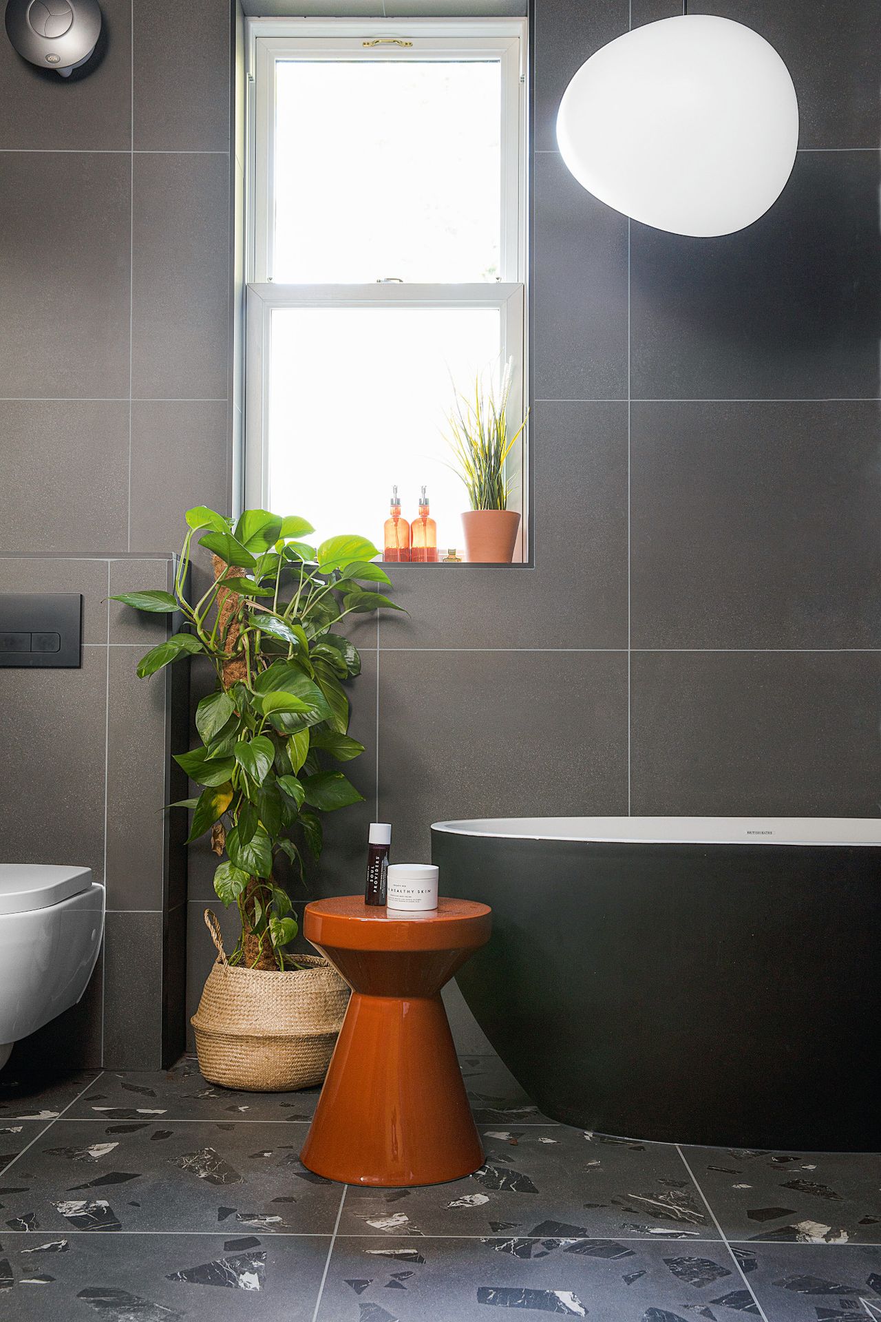
Bath, British Baths. Floor tiles, Petri range by Grestec. Vanity unit and basins, Tikamoon
(Image credit: Katie Lee)
In case you needed convincing, the case for terrazzo is right here in this pic. Choose a design that blends in with the rest of your scheme – like the grey in this bathroom – and you can treat it like any other surface. Pro tip: using large-format tiles on the other surfaces will contrast nicely with terrazzo’s intricate detailing.
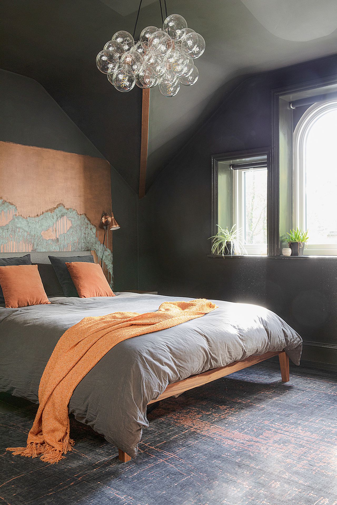
Walls, floor and ceiling painted in Madison Grey, Abigail Ahern. Copper effect paint, Craig & Rose. Lansdowne bed, Made. Bubble chandelier, Dowsing & Reynolds. Madmen Soho copper rug, Louis de Poortere. Float copper wall lights, Nordlux via Lightsource
(Image credit: Katie Lee)
Forget light fittings and brassware: look to your surfaces and other finishes to bring in metallic accents. This headboard is actually a panel painted with copper-effect paint, and the patina finish makes it look like it’s been beautifully weathered over years. Vanessa tied the scheme together with copper-orange cushions and a throw, which contrast with the grey of the walls.

